The Wild Influences Behind the Look of Teenage Mutant Ninja Turtles: Mutant Mayhem
The minds behind the unique look and feel of Teenage Mutant Ninja Turtles: Mutant Mayhem give us an inside peek at the film’s wild designs and world-building.

This article is presented by Paramount Pictures. ![]()
Teenage Mutant Ninja Turtles: Mutant Mayhem brings back the iconic reptilian quadruplets for another wild adventure in the animated world of New York City. But for this story, director Jeff Rowe and writers Seth Rogen, Evan Goldberg, Dan Hernandez, Benji Samit, and Rowe himself bring two new ideas to the screen: casting actual teenagers as the Turtles themselves and applying their own unique spin on the current trend of stylized, exaggerated visuals, jump-started by Spider-Man: Into The Spider-Verse and continued with Puss in Boots: The Last Wish and The Mitchells vs. The Machines, which Rowe also co-wrote and co-directed.
Still, there’s a plethora of Teenage Mutant Ninja Turtles visions out there: several comics, more than five different TV shows, and six movies, not to mention the churn of toys and merchandise that have spawned from Kevin Eastman and Peter Laird’s original creation. Mutant Mayhem seeks to stand out by emphasizing the youthful adolescence of the turtles, not just by casting teenage actors to play the heroes, but the very visuals themselves—the animation, the shot selection, the colors—are meant to support this radical take on the familiar coming-of-age story.
Kent Seki, Mutant Mayhem’s head of cinematography, wants to emphasize the ephemeral youthfulness of the main four by keeping the camera close, handheld, and alive. “We shot it with a handheld style, almost like [you’re] on the run, [as if] you’re hanging out with your friends, they’re goofing around, and they ended up kicking the skateboard into the window or the door of the bodega, and they have to run off. That’s what we all did when we were teenagers getting into trouble. And that became a source of inspiration.”
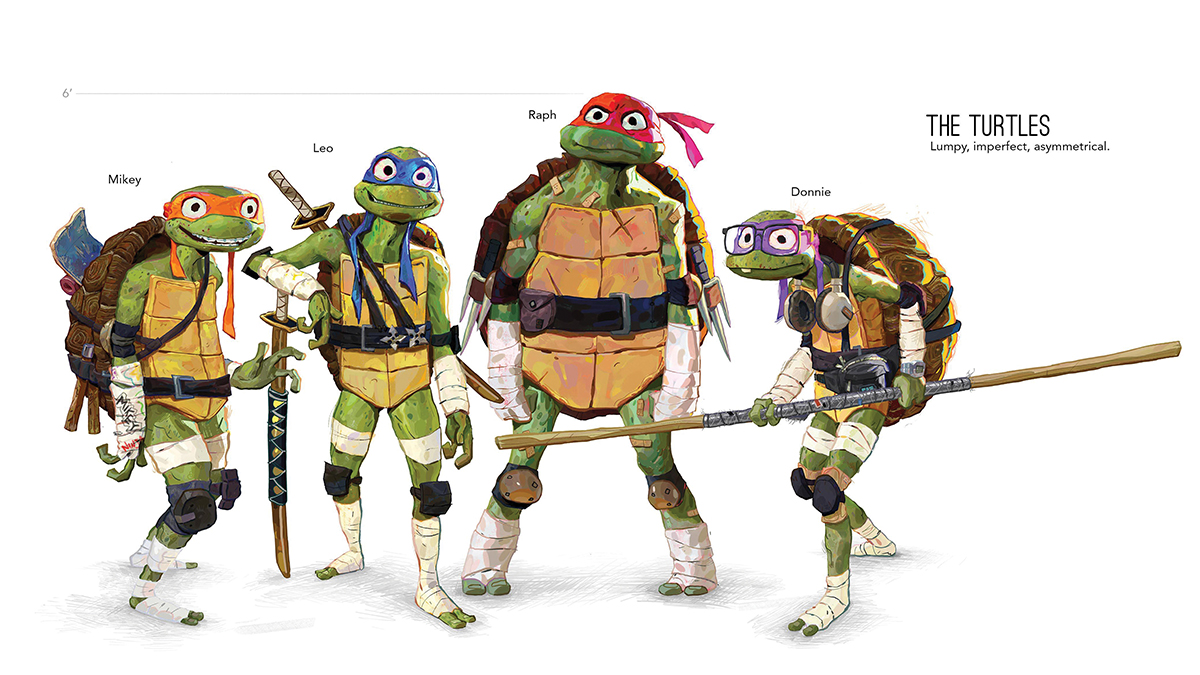
Seki sought to utilize a “cinema vérité” style to film Leo, Raph, Donnie, and Mikey as they engage in their antics, both comedic and action, with the seminal work of Emmanuel Lubezki and Spike Jonze informing that look, while the film’s lead character designer, Woodrow White, goes even further when describing the individual look of each sibling, moving away from the “mono-style except by mask” of the classic Teenage Mutant Ninja Turtles and applying elements to truly showcase the four heroes as young, budding teens.
“Jeff and I were on the same page with the Turtles, the ‘teenage’ being emphasized in the Teenage Mutant Ninja Turtles—we wanted them to sound and look like teenagers,” White says. “So we were always pushing for a less bulky version of the Turtles compared to the previous versions…the vision in our head was that we wanted something new and fresh and more relatable. We always had in mind a slightly skinnier version of the Turtles, kind of more teenage builds.”
White even expands on some of the finer details of some of the brothers. “We always knew we wanted Donnie to have glasses. It’s just he’s commonly [known as] the brainy one, but also, I just think a Teenage Mutant Ninja Turtle [wearing] glasses is funny. Not necessarily as a defining trait of wisdom or geekiness but rather a defining trait of adolescence. Glasses on Donny, braces on Mikey… they’re all these sort of visual growing pains that we can all relate to being a teenager.”
The Turtles’ adolescent narrative journey is meant to butt up against the adult world, at once steady, confusing, and… well, ugly (but in a good way). If the Turtles’ world is shot to look spontaneous, reactive, and “in the moment,” the adult world around them is more controlled, formalized, and grounded.
“What we wanted to do was contrast the handheld Spike Jonze of it all with the kids,” Seki says. “We took another inspiration from early Paul Thomas Anderson [and] his work with [cinematographer] Robert Elswit on Boogie Nights, where there’s a more formal camera language. So, we have the spontaneous, where you’re just trying to follow the action, and then we have the more formal, camera-driven world of PTA. Those two worlds are separate.”
Seki continues: “When we shot scenes, we would use these different techniques to support the subtext of what was happening. So if the kids were being reprimanded by Splinter, [we] would be much steadier with the camerawork, and then when we cut back to the kids, they’d be a little bit more handheld, a little more loose, and those kinds of things started to creep into the cinematography. So we had this dichotomy of the teenage world and the adult world.”
Both worlds are a treat to look at. Spider-Verse may have kickstarted the new wave of hyper-stylized CGI animated films, but Mutant Mayhem has a style all its own, with an overall visual look that came from a fairly unlikely place: a teenager’s sketchbook, a “design philosophy” that production designer Yashar Kassai describes as “draw like you’re 15,” “be emo and cringe,” and even “draw very serious things but add levity by drawing them shitty.”
“A lot of this film’s look is inspired by my own sort of loose sketching and painting style,” says White. “We wanted it to resemble the looseness of not only my work but also of teenagers’ work—the way a teenager might draw in a sketchbook, all these crazy monsters and people.”
“We’ve all been young, untrained artists in class doodling in the margins of our notebooks when we should have been paying attention,” Kassai says. “I think that it’s very relatable. In the current animation landscape of perfect and symmetrical characters, it’s refreshing for us to pursue something so imperfect.”
Indeed, New York City in Seki’s camera looks sketchy, scribbly, and asymmetrical, like what any kid might draw in the margins of their notebook, but with a full-fledged studio budget behind it. Offbeat and slightly askew NYC iconography fills the screen with vibrant but familiar colors, turning the skyscrapers, streets, and sewers into a playground from a kid’s imagination.
“I can definitely say that one of the big color influences were the toys themselves,” Seki says. “I feel like we chart our own path, but there was amazing attention paid to the color palette of the toys, the chunkiness of those toys. Even the color palette of the original cartoon series was very influential on the film itself. And even in the beginning, when they have the white eyes, it’s very much a nod to the comic book…. So there are little elements of that throughout the whole movie.”
“The amount of detail layered onto every mutant character in that [original toy line] was insane,” adds production designer Yashar Kassai. “As for the movie’s lighting and color, it oscillates between authentic New York nights and surreal alien color schemes. The photography of Alex Webb is a strong influence.”
To be clear, trying to apply so many of these ideas—the live-action camera language, the “teenage sketchbook” look and feel, the point-of-view of a much younger take on the Turtles—proved to be quite a challenge. Or, at least, a different challenge.
“It’s not that one is harder than the other; it’s a different problem to solve,” Seki says when describing how to apply live-action principles to animation, much of it in various stages of completion. “We have to make sure that the camera feels authentically real, and creating that realism in the camera is very challenging with a CG-perfect camera. How does the camera start moving? How does it stop? Does it have a jostle in it? We had a moment in the making of the movie where we had tried to infuse this live-action handheld feel. It feels weird, especially early on in the animation process, because you’re working with previz characters in previz animation, which isn’t complete, so it’s very wooden. If there’s a camera with a lot of movement and then you pair it with wooden animation, which will eventually be replaced, it feels strange.”
Seki recalls: “We actually went to a screening room in Nickelodeon, and I brought a ton of live-action references that [utilized handheld cameras]. When we watched it and then watched our sequence, Jeff [Rowe] said, ‘You know, this is really going to have to be a leap of faith. We have to believe that this camera that feels a little jarring right now will work when it has the final animation, which will be months later.’ That alone says something about how difficult it is to really know what’s going to work. We had to take that leap of faith.”
No doubt the Mutant Mayhem team hopes that audiences will take their own leap of faith when the film drops this August. But the balance between the original depiction of the Teenage Mutant Ninja Turtles and the more updated version on display has been carefully, craftily curated. “We wanted to bring a combination of new and old,” White says. “But what I mean is that we wanted a fresh new spin on the Turtles, but we also wanted to bring the energy of the TMNT toys from the ’80s and ’90s. The creepy, gross-out visual aesthetic that I loved as a kid, and energizing it with this new contemporary style.”
Mutant Menagerie
Woodrow White also explains how the movie’s cast of mutant characters evolved for a new generation:
Splinter
“We wanted to lean into the dad aspect of Splinter in Mutant Mayhem. He’s very disheveled looking from the stresses of parenthood. But he’s still a ninja master, so he wears a kataginu that he cut from a discarded bathrobe. This reflects his improvisational, D.I.Y. way of life. He’s working with what’s available in the sewers to create a comfortable environment for him and his four sons. And then there’s the sweatpants, which are a common staple of stay-at-home parents. Jeff Bridges’ The Dude character from The Big Lebowski was a big fashion inspiration. Splinter’s build was partially inspired by Danny DeVito, with his short stature and long arms. One gripe I had with Splinter in many different versions of TMNT was that he wasn’t ever quite authentically ratlike enough. So I studied a lot of photos of rats.”
Leatherhead
“I didn’t want to make Leatherhead muscular because I felt like I was leaning too much into Killer Croc territory, the Batman villain…. I just started sketching out an alligator, and I started asking myself what an alligator would look like if it could stand on two legs. And so that’s how you get that upside down L structure to the character composition…. I feel like a more humanoid alligator wouldn’t look quite as funny carrying a shotgun the way an almost-alligator looks carrying a shotgun and hunting goggles.”
Genghis Frog
“Our production designer Yashar Kassai helped out a lot with this one. I knew one of my desires in creating Genghis Frog was to make him a pixie frog [another name for the heavy-set African giant bullfrog]. I don’t know if you’ve ever seen one before. But one of my goals was to use a pixie frog as a basis for Genghis. I did some sketches, and Yashar did some sketches. And I think Yashar really tied that one together himself.”
Rocksteady
“In previous versions, I was a little frustrated by the size of Rocksteady’s head, him being a rhinoceros. A rhino’s defining feature is his horn. So I imagined Rocksteady with a humongous, imposing head just to bring out what really gives a rhino his strength: the incredible charging power of a rhinoceros horn.”
Ray Fillet
“I wanted to give him a more menacing edge. And I wanted to also inject more actual manta ray into his character. Ray Fillet is like an action movie scuba diver commando character—like a Jean-Claude Van Damme or Arnold Schwarzenegger type. So I gave him these tactical scuba suspenders and gave him a knife and made him really hardened and rugged.”
Wingnut
“I definitely leaned into the very animal aspect of Wingnut. Earlier versions of Wingnut had two arms, two wings, or two legs, and I wanted to keep Wingnut more bat-like by keeping her two arms on her wings and giving her cybernetic arms because [she’s a] cybernetic mutant. [Original Wingnut] has mechanical wings. The more I fussed with the mechanical wings, I became a little too frustrated…. So I placed the cybernetic part of Wingnut on her arms to sort of retain that futuristic, high-tech element.”
Teenage Mutant Ninja Turtles: Mutant Mayhem hits theaters on Aug. 2.