How Mega Man Ended Up With the Worst Video Game Box Art Ever
Mega Man's infamously awful NES box art has since taken on a life of its own.

When a property runs long enough, there are adaptations and versions of the characters that become infamous for being so off the mark and bizarre. There’s that time when Dennis Hopper played Bowser as a politician with silly hair in a dinosaur dystopia. The Teenage Mutant Ninja Turtles once went on tour as a rock band. The United States made a Godzilla movie so bad that the monster was later killed within seconds in a fight against the true Godzilla. The animated series Captain N: The Game Master once introduced Alucard as a radical skateboarding teenager with sunglasses.
Captain N also gave us a terrible take on Mega Man, making him an annoying toddler-looking guy with a froggy voice. That isn’t the most infamous version of the Blue Bomber…even if he wasn’t even blue. No, that honor goes to the character on the cover of the first Mega Man game.

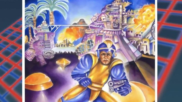
Oh, no, no, no. That’s Rock Man for the Famicom. Totally different in that it looks like a good rendition of the hero and his enemies. We’re talking about this North American box art for the NES version of Mega Man:
It’s the thing of legends. Imposed over the 80s-as-hell grid design is this watercolor quagmire featuring a middle-aged man who vaguely looks like Mega Man in front of a burning cityscape that is both overly busy and ugly. Mega Man himself has the sleeve equivalent of Hammer Pants, a handgun, and a yellow and blue color scheme. Strangely, Mega Man’s powers are all about him changing color schemes, but none of his seven options in the game include this color combination.
It’s not just the accuracy of the design. The anatomy of the stance is all out of whack, from Mega Man’s lack of neck to the asymmetric nature of how his legs apparently work. Even the watercolor choice fails to make this pop as a futuristic action adventure, instead feeling more like a page of a coloring book about the Easter Bunny. That background laser grid is doing some heavy lifting.
It’s a baffling beginning for one of gaming’s most famous characters that raises a very important question…
How Did This Happen?
Who is the artist behind this infamous box art? Oddly enough, nobody seems to know for sure, even with there being a signature under the rightmost yellow dome…platform…thing. What the hell even is that?
The “Who?” of this cover may be a mystery, but we do know a little more about the “How?” and “Why?” In 2003, G4 released an Icons episode about the Mega Man series, which was even included as an unlockable in the Mega Man Anniversary Collection. Briefly, Chris Beiniek of Tips & Tricks went into the story behind the box art.
“The box art for the first Mega Man game in the US was done very quickly. The President of Capcom US said to his marketing guy, you know, ‘We need a cover done TOMORROW,’ and he went and got a friend of his to do it in like six hours, and that’s the reason why it turned out so bad.”
There is no source to these claims, but again, this was thrown onto an official Mega Man release, so there’s at least an air of legitimacy to it. Luckily, the story is mostly corroborated nearly a decade later, as former Capcom USA Vice President Joe Morici shared his perspective in an interview with Game Developer.
“The reason it was so bad was because we had literally 24 hours to turn it around. Nintendo said, ‘We need your artwork by tomorrow.’ Somebody worked all night long to come up with this garbage-looking box, and then we released it because we had no choice.”
Still nothing about the identity of the crunched artist, but I’m sure whoever they are, they’re probably perfectly fine with keeping it that way.
The Overshadowed Back of the Box
Something that rarely gets talked about with the otherwise infamous North American box for Mega Man is that the back is nearly as unhinged as the front. The rush job (no pun intended) goes together with some really rough translations of what the game is about.
“It’s MEGA MAN versus the powerful leaders and fighting forces of Monsteropolis – that strange multi-layered land of robot-like Humanoids created by the wrongly-performed experiments with human beings by Dr. Wily,” reads the opening of the game’s description. “For he dares to single-handedly penetrate Monsteropolis’ seven separate societies to stop the rapid expansion of strange misrepresentations of humans.”
That word salad goes on for a few paragraphs, accompanied by a single in-game image, which is merely the boss menus select screen. If the front of the box doesn’t make it clear that Mega Man’s NES packaging was the result of several miscommunications or a complete lack of relevant information, the back of the box certainly will.
Mega Man isn’t the only bizarre Capcom hero appearance here, as this release is part of the “Captain Commando Challenge Series.” What that means is that failed Capcom mascot Captain Commando appears on the back cover and in the manual. It was basically just fancy branding for any and all Capcom NES games released during its early years. Interestingly, Captain Commando has yet to adopt his more well-known design from his self-titled beat ‘em up game where he looks like Scott Summers as a blond cyborg sheriff. Here, he’s some kind of elderly gunslinger from space with gold medallions around his neck and a popped collar.
Later releases dropped the Captain Commando branding, added a few more in-game screenshots, and cut some of the text. The text that remains is still a mess and includes the above paragraph about “robot-like Humanoids,” but hey, progress is progress.
The damage done by this box was more than superficial. Mega Man was not a best seller for Capcom. Some sources claim it sold somewhere around half a million copies, but that includes international sales and later purchases when the franchise had started to catch on. Game artist and later series producer Keiji Inafune would claim in interviews for Play and Nintendo Power that he thought the North American box art did a ton of damage on that front, though he might have only been half-joking. Luckily, the game had good word of mouth and didn’t die on the vine.
The Road to Improvement
North American Mega Man box art never hit the lows of that first entry, but it still took a little time for them to become truly accurate. The cover for Mega Man 2 is notable for being off in its own way, as Mega Man, Quick Man, and Crash Man come off as more Western superheroes than stout robot men. The thing that sticks out is that once again, Mega Man is wielding a pistol instead of an arm cannon.
This time, we have some real answers behind what’s going on with this one, as artist Marc Ericksen explained the artistic choice in a 2012 interview with Nintendo Age. As he put it, he and the art director were shown a beta run of the game with no reference to the Japanese art. Ericksen was confused at the pixel art of Mega Man shooting because it wasn’t apparent to him that Mega Man’s gun was an extension of his arm. He was confused by what he was firing out of.
The art director shrugged and assumed Mega Man was using a pistol as it certainly couldn’t have been a rifle. Luckily, Ericksen had a day and a half to work on his cover, so it wasn’t quite as rushed. Plus, it looks pretty cool in its own right and successfully illustrates that Mega Man is a colorful action game much better than its predecessor.
The following games finally figured out how to display the proper Mega Man look, though Mega Man tended to sport that Sonic the Hedgehog-style smirk. He was also typically portrayed as being incredibly jacked for…reasons.
That isn’t the end of the road for the original Mega Man art style, though. When the retro-style Mega Man 9 and Mega Man 10 were released in 2008 and 2010, they debuted with mock box art in the style of those early releases. Granted, this time they were intentional artistic misunderstandings of the source material.
Actually, there was a bit of a renaissance of that “classic” Mega Man art style throughout the 2010s. In 2010, a stop-motion animated trailer for Mega Man Universe depicted the game as a kind of customizable remake of Mega Man 2. Box Art Mega Man made a stinger cameo, revealing that he would be playable. A month later, a demo was playable at New York Comic Con, allowing you to play as Box Art Mega Man, as well as other incarnations of the Super Fighting Robot.
Around that same time, Street Fighter X Tekken was announced. Not only would the game feature heroes and villains from the two fighting games, but the PlayStation 3/Vita versions included exclusive fighters, such as Pac-Man in a Mokujin mech and Mega Man. Not just any Mega Man, though, but a fat, gun-toting human designed to look like Box Art Mega Man.
A joke for sure, but one that shouldn’t have stung due to the then-upcoming releases of Mega Man Universe, Mega Man Legends 3, and Maverick Hunter. The problem was that all three of those games were eventually canceled. To rub a little more salt in the wound, Marvel vs. Capcom 3 and its Ultimate upgrade made jokes about keeping Mega Man out of the game. So the only playable Mega Man we’d see for years was this dumpy, middle finger of a guest character. Fans were not happy.
The Box Art Mega Man Legacy
Box Art Mega Man would continue to receive the occasional reference, like making cameos in both the first and final issues of Archie’s Mega Man comic series. More recently, he appeared as a poster and action figure in the Resident Evil 3 Remake.
It’s funny, there are countless video game box cover designs out there and there are only a few that have us scratching our heads and wondering what the story was behind them. We’re talking about the nightmarish orb faces on Bust-a-Move 2: Arcade Edition or the confused, old man playing a banjo on Phalanx. Yet, Mega Man had one of the worst, ugliest, most inaccurate, and potentially detrimental pieces of box art in gaming history, and fan culture has learned to laughingly celebrate it.
Just because something was dumb at the time doesn’t mean it needs to be hidden away forever. Such things should be flaunted as part of a greater whole. Make it fun. Have Deadpool make regular references to how silly his mouthless Baraka design was in X-Men Origins: Wolverine. Have Star Wars characters bring up Life Day and Jaxxon the Rabbit like it’s a normal thing. Make the ugly Sonic the Hedgehog design from the first movie trailer his own character.
Once upon a time, a rushed artist armed with pastels on a paintbrush turned a dynamic, wide-eyed video game sprite into a badly-dressed, squatting gunman who looked like he was way too old for this shit. And you know what? At the end of the day, we as a society are better for it.