Doctor Who: A History of Dalek Redesigns and Fan Reactions
Daleks are a design classic that have evolved throughout Doctor Who history. We revisit the times they were changed and what fans had to say about it...


I think we can all agree that the 2005 redesign of the Daleks was a huge success, right? Nobody had any issues with them surely? Apart from Raymond Cusick, who originally designed them in 1963, and noted in Doctor Who Confidential ‘To them rivets and bolts are archaic.’ So obviously you can’t please everyone.
Last Thursday, which was approximately four years ago, the Radio Times was released with a new Dalek design on the cover. The slightly taller and thinner black Dalek is based on the Reconnaissance Dalek from the 2018 special ‘Resolution’, something which executive producer Chris Chibnall says is a plot point, describing the 2020 special as a sort of sequel to that episode. It looks better in the trailer than it does in a static image, and it’s been implied that the new design is a variant rather than the standard model.
The Daleks have had numerous variants and tweaks to the standard model over the years, with two major redesigns in 2010 and 2018. You could though, argue there were four major redesigns: the design seen in the Radio Times and ‘Resolution’, plus in 1985 four new white and gold Daleks appeared in ‘Revelation of the Daleks’ (a review of the story in the TARDIS fanzine mentioned the redesign among the positives) plus a Glass Dalek (made of Perspex) and then there were four white and gold Daleks in 1988’s ‘Remembrance of the Daleks’.
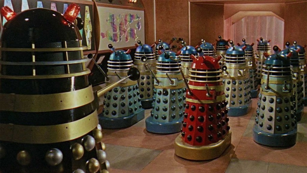
However, the white and gold props for ‘Revelation’ (made from a new mould for props at a 1984 horticulture festival in Liverpool) were then painted in greys for ‘Remembrance’, with the white and gold Daleks being new props with variants on the original design. The new Daleks also included an Emperor inspired by the Sixties comic strips and a Special Weapons Dalek, originally conceived as a floating weapons platform and adjusted to fit Doctor Who’s budget. Justin Richard’s 1988 review of the story in Doctor Who Bulletin was not especially complimentary about either.
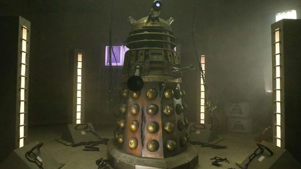
It’s at this point that I should mention the Target Novelisation of Remembrance of the Daleks has an entire chapter from the point-of-view of the Special Weapons Dalek and if you haven’t read the Target Novelisation of Remembrance of the Daleks then I thoroughly encourage you to. I’d alsorecommend, if you’re interested in further reading, Jon Green and Gav Rymill’s Dalek6388 website, which is an incredible piece of work detailing the history of the Dalek props as they were built, used and refurbished.
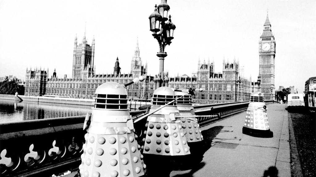
So we have a good idea of when Dalek props were updated through this work, but what we don’t have for most of the show’s history are contemporary reactions to the design changes. Audience Research reports during the Sixties don’t note any responses to the different designs. We have nothing for the first Dalek story, save a comment in the Daily Mail that children had been asking what would happen to the props. ‘The Dalek Invasion of Earth’ comments are a mixture of happy viewers and people frustrated by the lack of Daleks in the first episode. Responses to ‘The Chase’ are mixed, with one viewer calling it refreshing in the context of the series thus far, a general agreement on it being silly but a disagreement on whether this is a good or bad thing.
None of which suggests people were especially bothered by the evolving design of the creatures. In ‘The Daleks’, the design from Raymond Cusick is largely as it would be going forward, but with a metallic collar around the “shoulders”, the area around the gunstick and sucker arm. For their second appearance in ‘The Dalek Invasion of Earth’two changes were made: a dish was added to the back of their collar to explain how Daleks could operate outside of their city. Secondly the fender, the base of the prop, was considerably enlarged by designer Spencer Chapman to allow the Daleks to traverse the outdoor terrain that filming required. This made them taller than Cusick’s original designs, and it was this approach – closer to a human eye line – that was used for the Amicus film adaptations of the first two Dalek stories.
The first one of these really distinguished itself from the black and white television version with blue being the standard colour for the Daleks, with a red second-in-command and a black and gold leader.
These designs, and indeed some of the props, would be adapted for the television series, notably for the Dalek Supreme in 1973’s ‘Planet of the Daleks’ (based on a prop from the second movie, which can also be seen following Terry Nation around in this interview on Whicker’s World). This was described as “very impressive, with its black and gold livery and its customised eye-stalk and dome-lights” in The Television Companion by David J. Howe and Stephen James Walker (1998), but as ever we have little in the way of primary sources.

Back in the Sixties, ‘The Chase’saw Raymond Cusick return as the designer. His preference for a smaller, stranger design saw the fender return to its original size, and he felt that the dish on the back of the Dalek could be improved upon. He came up with solar panelled slats on the shoulders in place of the collar, and this overall design stayed largely the same until 2010.
The task of the 2005 redesign was given to production designer Edward Thomas and the BBC Wales Art Department, and based on concept art by Matt Savage. The teams’ instinct was to preserve the silhouette of the Dalek, but Thomas referenced the redesign of the Mini Cooper – a Sixties classic that was bulked out for a relaunch in 2000. Showrunner Russell T. Davies asked for the colour scheme to be bronze and gold and the lights to be similar to the Amicus movie Daleks.
Reviews of 2005’s ‘Dalek’ were almost completely positive, but weren’t wholly preoccupied with the Dalek prop itself. In a way that vindicates the decision to keep the design similar to the original, a continuation that meant the changes weren’t commented on in the papers. What we saw in 2010, when the design did change the silhouette, was deemed more worthy of comment outside of fan forums.

In 2008, Steven Moffat was planning his first series as showrunner of Doctor Who. With a new cast, TARDIS interior and exterior, logo, title sequence and theme tune it was decided that the Daleks would also be revamped. Taking on board Raymond Cusick’s point about seeing screws, nuts and bolts in the design, Ed Thomas and concept artist Peter McKinstry sought to introduce smooth lines to the design. Moffat and scriptwriter Mark Gatiss were aware that the Dalek redesign couldn’t veer too far from the original, but were inspired by the colours and height of the Amicus Daleks with an added weapon hatch at the back, creating a hump-like boot. Moffat’s ideas included an organic eyeball and a colour palette inspired by sweets, “like you want to lick them”. This was in contrast to McKinstry’s desire for a metallic finish.

The response to these designs was not positive within fandom. Doctor Who Magazine dedicated a cover to the question ‘Is this the most controversial Dalek redesign ever?’ For the next Dalek story, the new designs had their colours muted and made more metallic (except the White Dalek Supreme), but were introduced as an upper echelon of Dalek society with the 2005 Bronze Daleks as the foot soldiers or grunts. The “New Paradigm” were seen twice on screen in the main show, with the Dalek Supreme from ‘The Stolen Earth/Journey’s End’ replacing the white model for ‘The Magician’s Apprentice/The Witch’s Familiar’, but the props were put to good use in exhibits and live events. As of yet, no one has been reported as licking them.
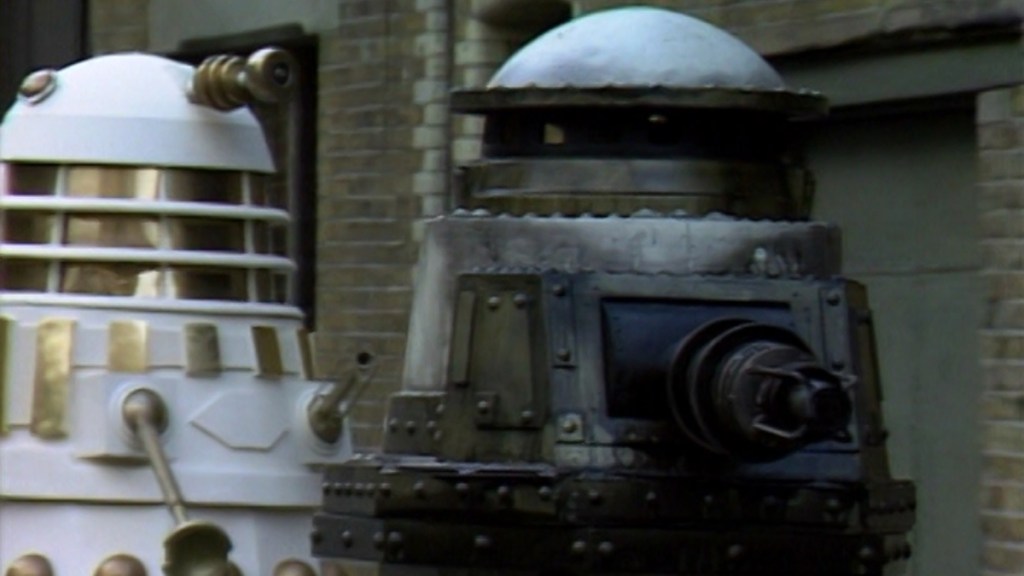
The last redesign we saw was in 2018, but this was a one-off Dalek made from scratch. The result had an intentional Scrapheap Challenge vibe and was now a remote-controlled prop rather than operated from within. Unlike the 2010 redesign, this Dalek’s different appearance wasn’t considered a new normal, and with the story providing more context for it the design provoked little to no controversy.

Overall it’s really only the 2010 redesign that’s been met with a lot of resistance. Daleks have survived changes to their appearance, their voices, their technology, their planet being blown up and at least three attempts at wiping them out. The increasingly difficult trick is how to deploy the universe’s most defeated fascist cyborgs in a way that doesn’t feel like a contractual obligation, but a story that actually needs to be told.