Designing Line of Duty: “Buckells’ Office Décor Reflects His Shallowness”
Line of Duty’s Production Designer takes Den of Geek behind the scenes on the police thriller’s sets and what they reveal about the characters. Spoilers
Warning: contains spoilers for the Line of Duty series six finale
In preparation for Line of Duty series six, production designer Gillian Devenney and creator Jed Mercurio discussed the character of Detective Superintendent Ian Buckells. An over-promoted dolt around whom smarter officers run rings, how would DSU Buckells decorate his office? Golf was the answer. “The decision to feature his enthusiasm for golf arose from discussions with Jed,” Devenney tells Den of Geek.
“Buckells’ character required some evidence of his shallowness and lack of commitment to his career – hence the framed golfing pictures, trophies and the bag of clubs poised ready to head out for the next round.”
It was the perfect choice, both for the character and for the ongoing game Line of Duty plays with its more obsessive viewers. After gangster Tommy Hunter was arrested at the golf club where he’d groomed a young Matthew Cottan into becoming corrupt police officer ‘The Caddy’, the series forever drew an association between golf, organised crime, and police corruption. Connecting Buckells to the sport via his office décor wouldn’t only reflect his laziness, it would also suggest a link to organised crime and perhaps to the mysterious corrupt officer code-named ‘H’.
That link wasn’t lost on the show’s hard-core fans when the golf-themed office was revealed. Nice try Line of Duty, we thought, but that’s far too obvious. As if Ian Buckells is H. You won’t get us that easily.

They got us that easily. The series six finale revealed that DSU Buckells was indeed ‘H’, a lazy, amoral officer with more devotion to his swing than the letter of the law. His office décor had been pointing the way all along.
“We’re fortunate on Line of Duty that Jed is available to give us insight on character motivation and states of mind. That’s not always the case. I think understanding psychological and dramatic motivation and using it to guide the visual setting is one big difference between Production Design and design for its own sake. Often it can be a key steer to the creation of an environment that not only seems realistic for a particular character or scene, but can contribute to what the director is aiming for and how the audience feels about the narrative.”
Take series six’s guest lead, DCI Jo Davidson, played by Kelly Macdonald. The clues to her character aren’t to be found in her office at Hillside Lane Station (a set built inside a disused Belfast school), but in her apartment. Devenney describes Davidson’s flat as a “lonely bunker” to which Jo withdraws “to deal with the legacy of her past and the pressures it has brought.”
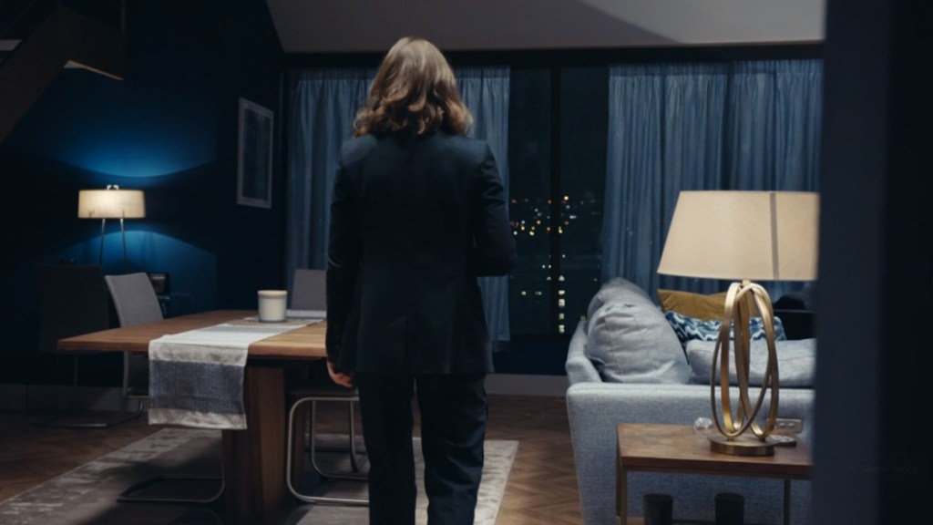
It’s not a real location, but a studio-build, she explains. “I wanted it to seem a bit ‘unlived-in’ to underscore Jo’s detachment from the possible benefits of an OCG link. It’s a cold place, hence the colours, minimalist décor and cool tones. By contrast, Farida Jatri’s home [seen in episode one] suggests a much less controlled environment, very much a living space. It’s obviously a place which Jo can no longer relate to emotionally.”
Character emotions are emphasised by their environments. The show’s prison cells, for instance, are deliberately minimal and stylised to reinforce the sense of sudden isolation. “Those scenes are invariably short, but have to accomplish a lot visually.”
The same goes for Line of Duty’s deliberately minimal, typography-only opening credits that appear as Carly Paradis’ now-iconic theme music plays. Peter Anderson (whose studio also produced the witty and baroque opening credits for Good Omens, and the emotional, clue-filled opening sequence for crime drama Unforgotten), hand drew the typography for Line of Duty for a very deliberate effect. “It’s all a little bit broken, a little bit imperfect. You can’t put your finger on it, but it’s not quite spaced properly, there are bits broken off the edge of letters.” The aim, says Anderson, is to mirror the storytelling. “It’s telling you as a viewer that there’s something not quite right, along the same line as the series: are the police good or bad? Who is or isn’t a criminal?”
There’s less ambiguity in the show’s sets and dressed locations, which, as well as for realism, are designed to visually represent power struggles and conflicts between characters. “Police HQ is the heart of the establishment,” Devenney explains, “so we went to the heart of the establishment – The Ulster Reform Club. The building dates back to 1885 and is in the centre of Belfast. It’s heavy with mahogany, drapes and ornate décor. Its imposing features perfectly highlight the confrontation of values between Ted Hastings and DCC Wise. She can’t hope to personalise such a space (her attempts are a little pathetic – shrubbery and family pictures!), and Hastings is powerless within it.”
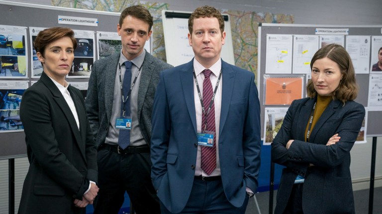
As opposed to AC-12’s slick offices, where Ted reigns. AC-12’s space is deliberately more modern than Police HQ, and less cluttered and personalised than “The Hill”, reflecting its professionalism. “It’s very ‘corporate’ with signage, computer screens, etc. It’s become such an intricate, multi-layered entity that I think it could almost step into the real world, from the most incidental piece of stationery, to vehicle livery, to the office complex itself.”
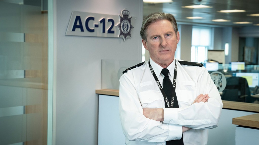
Devenney designed the Central Police logo that features on all of the above to be credible, generic, non-region specific and apolitical. “With printed and onscreen graphics such an important ongoing narrative device, we needed a solid, believable visual anchor that fitted a massive variety of applications. It’s a brand that suggests an organisation with depth and we apply it consistently whenever we can.”
The AC-12 set is portable, and broken down for storage between series. “I think it’s always preferable to see real stuff through windows – especially in a large space like AC-12, so it’s created within an existing building here in Belfast.” Three different buildings have housed AC-12 over the years. Series two, three and four each used different locations, while series five and six used the same building as in series three but two floors higher up than before. “The city views are now a bit loftier than they used to be!”
A key part of the AC-12 set is the “glass box”, which was built with pivoting glass panels to adjust to camera and avoid reflections. “The interviews are crucial to Line of Duty and the “glass box” was a way to allow the viewer a forensic viewpoint on the process.” For series six, the interview room and meeting room home to AC-12’s evidence boards were recreated in studio to maximise Covid safety. “They had no ceilings and although it doesn’t look like it onscreen, they were relatively open at ground level.”
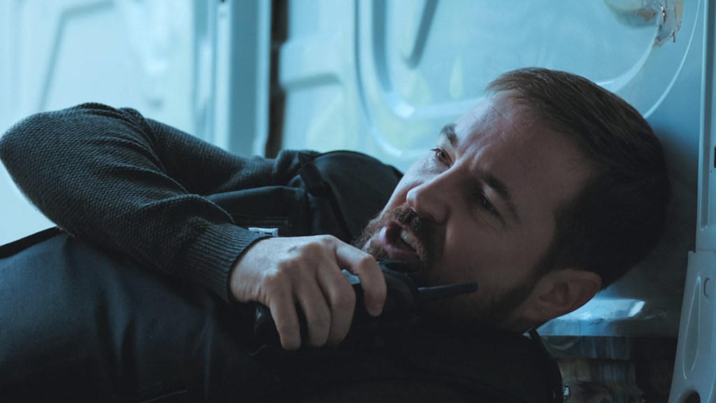
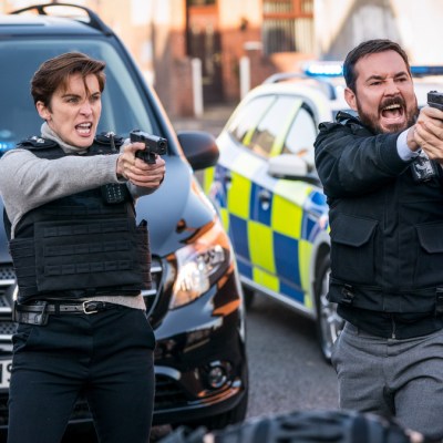
Devenney’s proudest achievement in series six is episode four’s van ambush. “On Line of Duty we’re well used to dynamic action sequences, but that was challenging.” The van interior, from which DI Steve Arnott pulled off a crack shot with a handgun while flat on his back, was built on a gimbal in studio and then matched with the action filmed on location. Every department was working at the top of its game. “Edit, sound design and SFX produced a coherent, electrifying sequence.”
Production design in a series like Line of Duty is all about supporting and not distracting from the storytelling, but Devenney’s team must work in red herrings for fans to spot, I ask. How about the magnetic letters and ‘H’ tile pattern spotted in the background of Steph Corbett’s kitchen? Devenney’s playful answer, made famous by Kelly Macdonald in her character’s mammoth series six half-hour interview scene: “No comment!”
Line of Duty series six is available to stream on BBC iPlayer.

