Why Final Fantasy Pixel Remaster’s Font is Angering Fans
Final Fantasy's recently revealed pixel remasters somehow found a way to ruin the original games' font.


The recently revealed Final Fantasy “pixel remasters” are already causing a surprising amount of controversy over the one element of these classic games you’d think would be impossible to get wrong: their font.
See, Square Enix says that these remasters are intended to visually reimagine the original Final Fantasy games through “universally updated 2D pixel graphics” that deliver “timeless stor[ies] told through charming retro graphics.” While it’s certainly a little strange to suggest that retro games need to be updated with retro graphics, the basic idea is that the company is trying wants to use modern 2D pixel art technology to upgrade the look of the first six Final Fantasy adventures while maintaining their original ar styles as much as possible. Ideally, that graphical “smoothing” would especially benefit the original three NES Final Fantasy titles and their obviously dated visuals.
However, fans are already pointing out that certain visual elements of these remasters actually look worse than they did in previous remakes/remasters of these games and even the original versions of these retro titles. As mentioned above, the biggest offender at the moment seems to be their font. That probably sounds silly, but to give you a better idea of the extent of this problem, take a look at this scene from the PSP remake of the original Final Fantasy game:
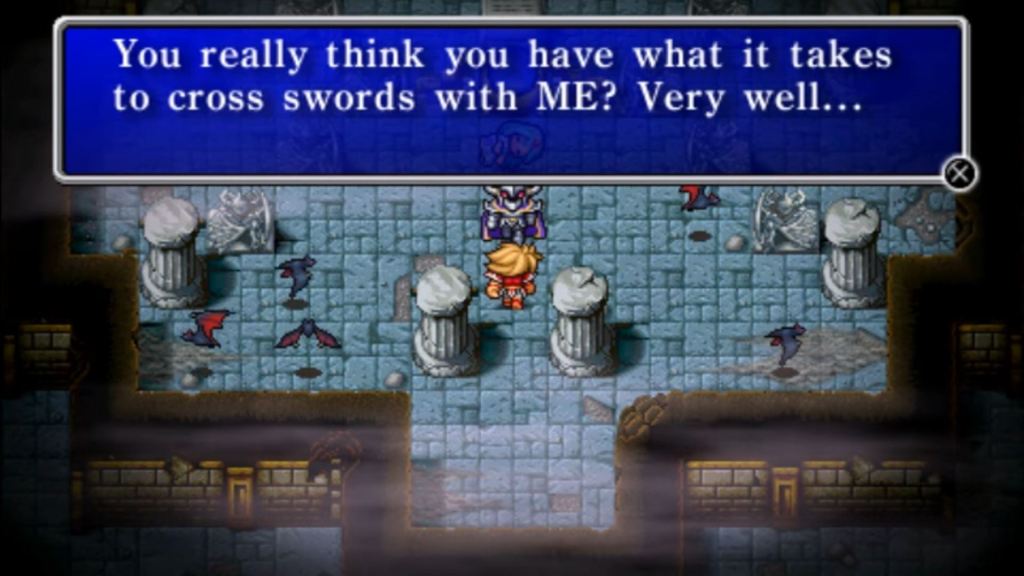
Now here’s that same scene as it appears in the “pixel remaster” version of Final Fantasy:
Even if you accept that those two releases are going for two vastly different visual styles and that the PSP version of the game was closer to a full rather than a comparatively simple remaster, it’s kind of hard to look past how bad the new font is. For that matter, it’s kind of hard to read that font in the first place.
Why is the new font so tiny and weirdly “clean” compared to the rest of the visuals? Well, it could just be a really questionable design decision (or the result of something that went wrong along the way), but the more popular theory at the moment is that this font was chosen for the benefit of mobile gamers playing these remasters on smaller screens. That’s nice and all, but the problem is that the PC versions of the games feature that same style of font. It’s as if little to no thought was put into the differences between those platforms. Mind you, this would hardly be the first time that Square Enix has halfheartedly ported a mobile version of a retro game to PC platforms.
And that’s really what this controversy is all about. To be blunt, Square Enix has a bad track record when it comes to re-releasing older games with minor visual updates that they claim will justify their often inflated price tags. Meanwhile, arguably better versions of these games exist on other platforms. It’s an altogether confusing and often infuriating practice that has many fans at the moment simply asking the question “Why?”
While these recent remasters don’t appear to be “unplayable” at the moment or even the worst remasters/re-releases Square Enix has ever made, they’re sadly another example of not just Square Enix’s spotty track record with these projects but the sad state of the modern gaming industry and how hard studios make it to access the ideal versions (or, in some cases, any version at all) of some of the greatest games ever made.