15 Terrible Tattoos We Just Can’t Support

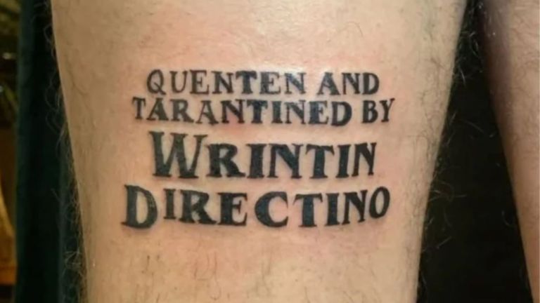
Getting a tattoo is a permanent decision, which makes it all the more surprising when some people seem to put almost no thought into it. Sometimes the problem is a simple spelling mistake, while other times it’s an unfortunate design, a poorly executed idea, or artwork that looks nothing like what was originally intended. The internet has turned these tattoo disasters into comedy gold, reminding us that not every idea belongs on someone’s skin forever. Whether they’re confusing, hilarious, or just impossible to ignore, these unforgettable ink fails definitely deserve a closer look.
Here are 15 terrible tattoos we just can’t support.
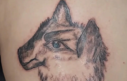
The wolf with a human eye
A wolf tattoo can look incredible, but adding a realistic human eye in the middle of its face creates an effect that’s more unsettling than artistic.
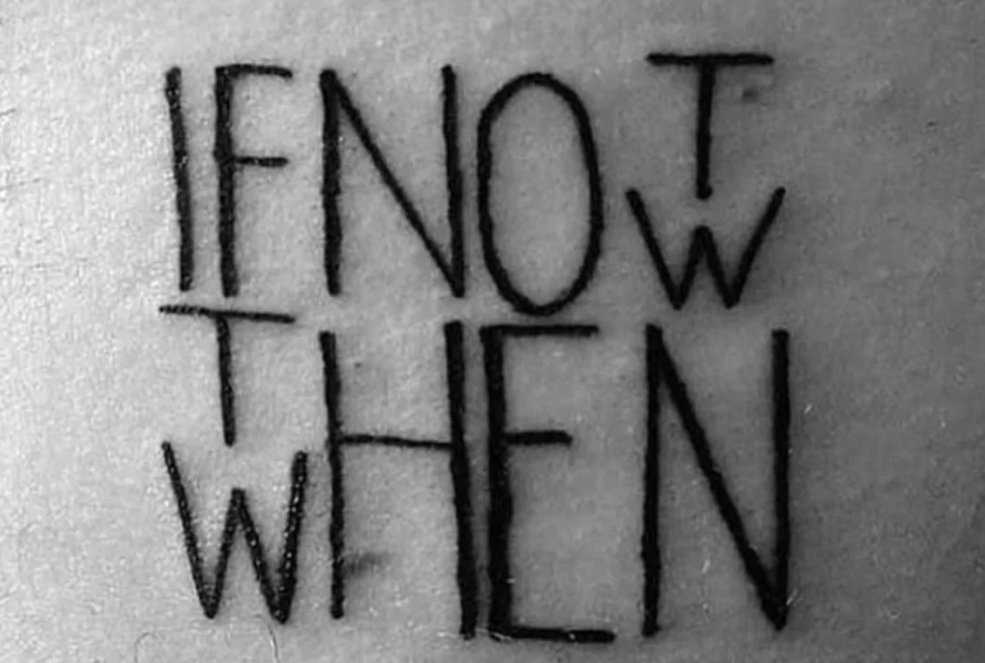
“If Not Now, Then When?”
The inspirational quote is technically correct, but the layout makes it surprisingly difficult to read. A few different line breaks could have saved everyone a headache.
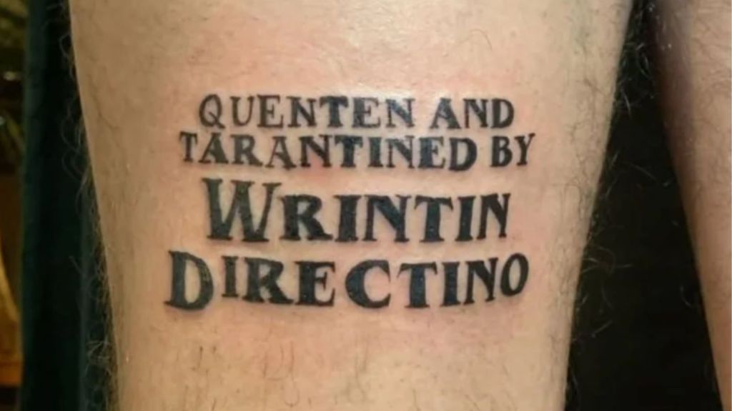
Quentin Tarantino… almost
Someone permanently inked “Written and Directed by Quentin Tarantino,” only to misspell both “written” and “directed.” That’s a painful typo to carry forever.
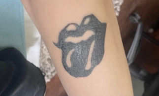
The Rolling Stones logo
The iconic lips-and-tongue logo somehow lost its proportions along the way. It’s recognizable, but only after a second look.
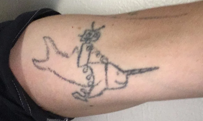
Whatever this is supposed to be
It might be a robot riding a swordfish… or something else entirely. Whatever the original idea was, it definitely got lost before the tattoo was finished.
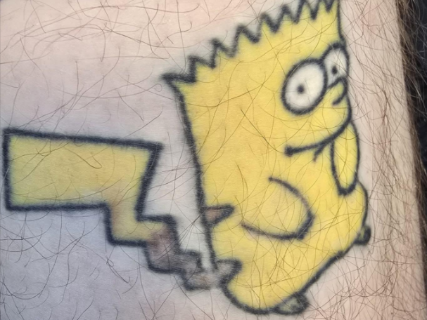
Bartchu
Bart Simpson and Pikachu somehow got fused into one confusing character. We honestly can’t decide which one should be more offended.
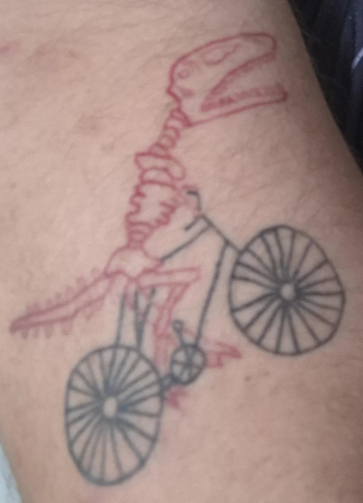
The cycling dinosaur
A dinosaur skeleton riding a bicycle sounds like a fun idea. Unfortunately, the execution looks more like a rough notebook doodle than a finished tattoo.
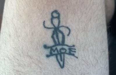
Whatever this is
The dagger is clear enough, but everything else around it feels like a mystery. Sometimes less really is more.
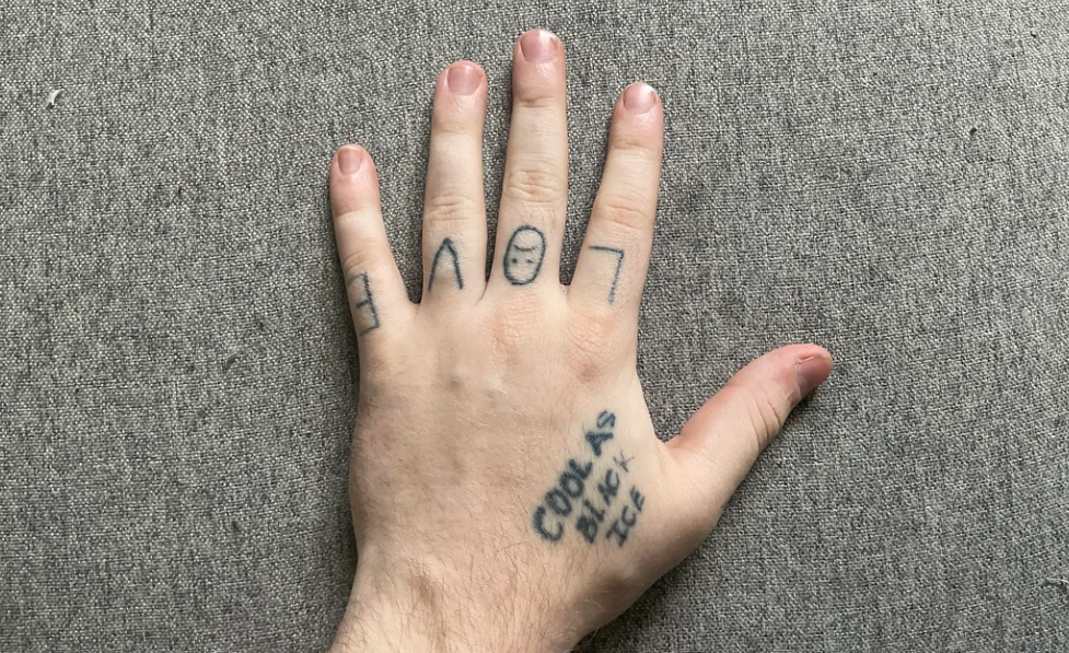
Love… maybe?
It’s meant to say “LOVE,” but the spacing and placement make it look more like a word scramble than a heartfelt tattoo.
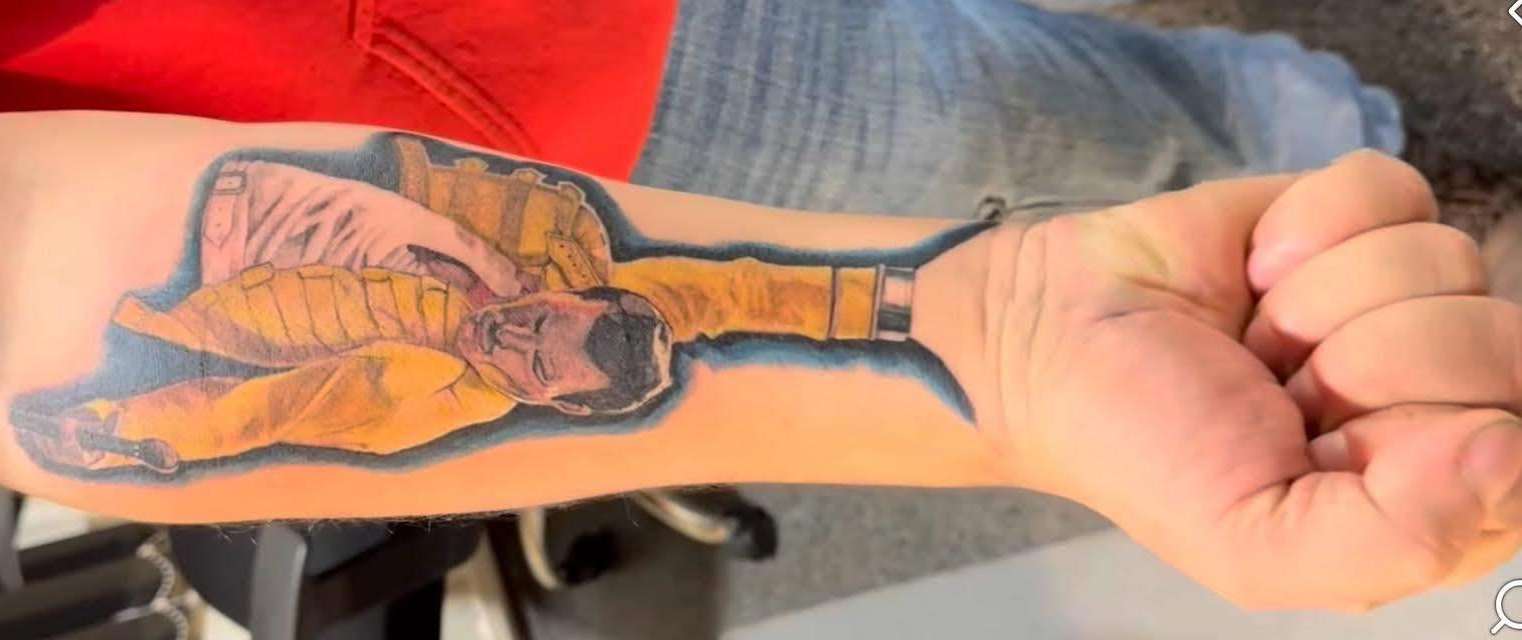
Freddie Mercury
Freddie Mercury deserved better than this. The proportions are so distorted that his arm somehow blends into the wearer’s actual hand, creating one very confusing illusion.
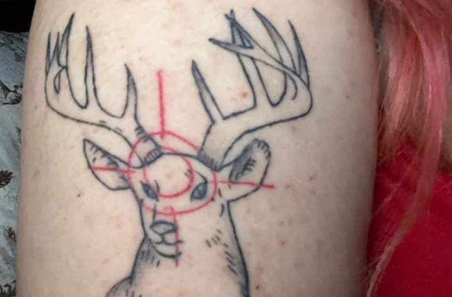
Target practice
The antlers look fine, but adding a bright red bullseye right on the deer’s forehead makes it feel less like wildlife art and more like hunting instructions.
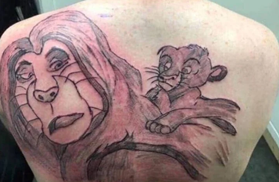
The Lion King… sort of
This was clearly inspired by The Lion King, but Simba and Mufasa both look like they’re questioning every life choice that led them here.
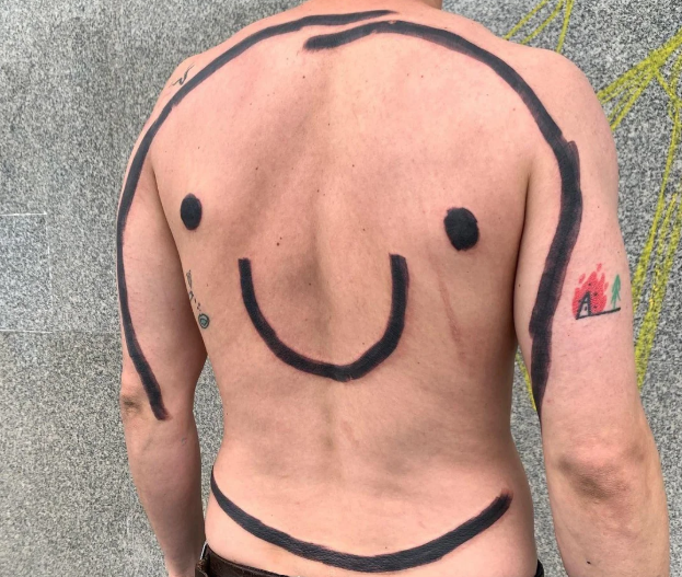
🙂
Commitment is admirable. Covering your entire back with a giant smiley face is certainly… one way to show it.
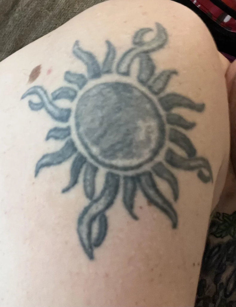
The blurry sun
It’s supposed to be a sun, but the soft lines make it look permanently out of focus. It feels less like body art and more like someone forgot to put on their glasses.