Movie Posters That Were Completely Different in Other Countries

Movie posters are not just marketing tools. They are cultural translations of a film’s identity, shaped by what studios believe will connect with different audiences around the world. Sometimes that means subtle changes in tone or colour. Other times, it means completely redesigning the concept so the same movie looks like a totally different story depending on where you are. Horror films can become romantic dramas, action movies can look like comedies, and serious awards contenders can be turned into something far more explosive or stylized. These variations reveal how perception can change with a single image. Here are fifteen movies whose international posters look radically different from each other.

The Matrix (1999)
Some posters emphasize the digital code and cyber aesthetic, while others focus more on character action poses and gun centered visuals.

The Shining (1980)
The US poster leans into minimalist psychological dread, while some international versions emphasize the hotel as a haunted structure, making it feel more like a traditional horror film.
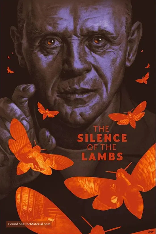
The Silence of the Lambs (1991)
Some versions lean heavily into horror symbolism, while others treat it more like a procedural thriller with understated imagery.

Titanic (1997)
Certain versions emphasize the romance between the leads, while others focus more on the scale and disaster aspect of the sinking ship.
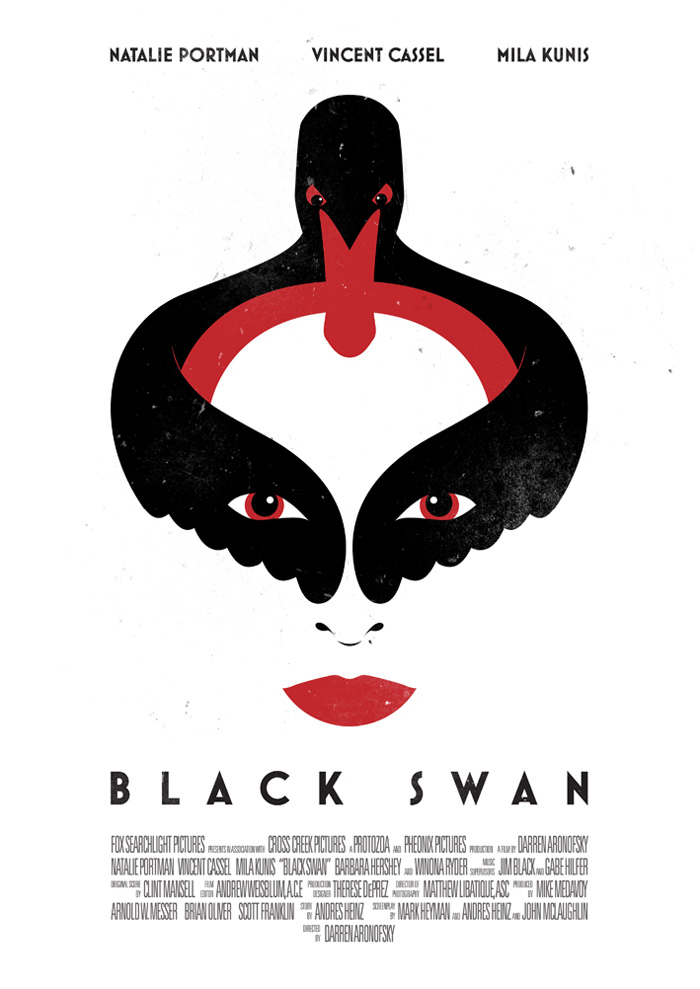
Black Swan (2010)
International posters range from elegant ballet imagery to disturbing, fragmented visuals, completely shifting the tone between beauty and psychological horror.
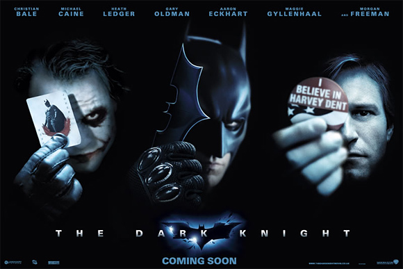
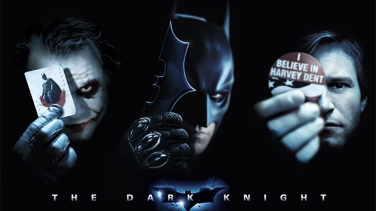
The Dark Knight (2008)
Some international designs focus heavily on The Joker’s chaotic energy, while others lean into Batman as a clean symbol of justice.

Blade Runner (1982)
Different regions highlighted either the noir romance or the sci fi action, creating posters that feel like they belong to completely different genres.
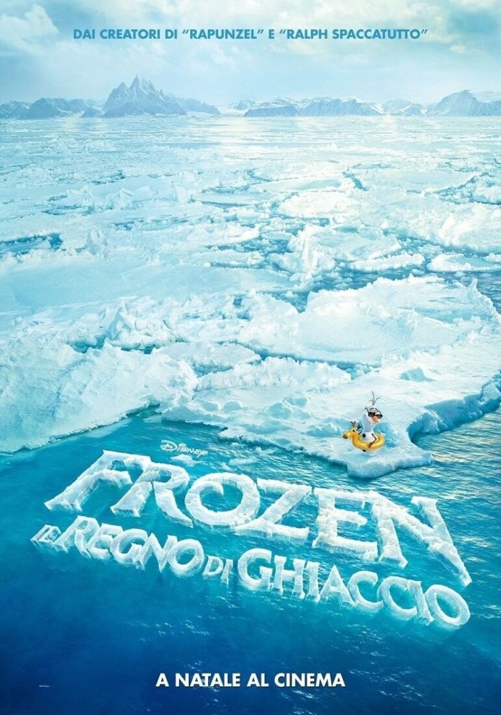
Frozen (2013)
Certain international versions downplay humour and focus more on fairy tale romance, while others emphasize comedic tone and character dynamics.
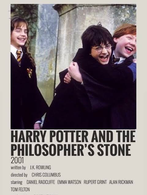
Harry Potter and the Philosopher’s Stone (2001)
Some regions used simpler art, while others opted for darker or more character focused designs, depending on audience expectations.
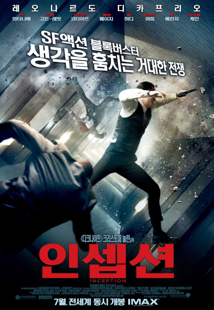
Inception (2010)
International posters vary between abstract dream imagery and more literal action focused designs with collapsing city visuals.
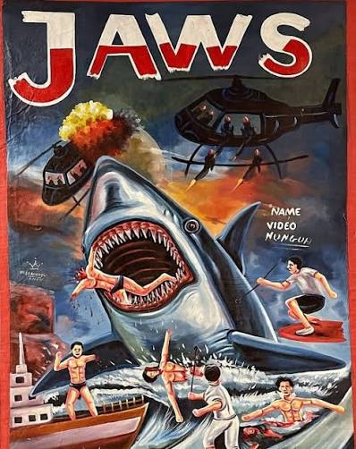
Jaws (1975)
While the iconic American poster focuses on the shark beneath the swimmer, some foreign versions exaggerate the monster aspect, turning it into pure creature horror.

Mad Max: Fury Road (2015)
Some posters highlight chaotic action and vehicles, while others simplify the design into character driven desert imagery.
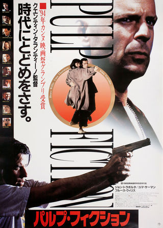
Pulp Fiction (1994)
The iconic Uma Thurman pose is sometimes replaced or reinterpreted with collage style designs that shift the tone from cool minimalism to chaotic crime drama.
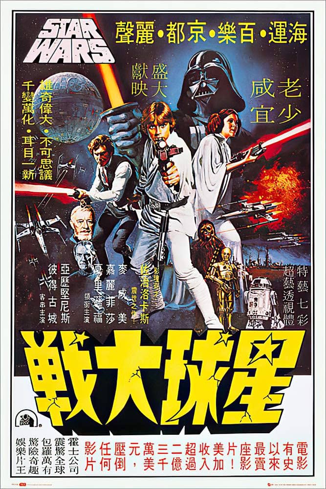
Star Wars: A New Hope (1977)
Early international artwork varies widely, from minimalist space opera designs to highly illustrated action posters that feel almost like fantasy epics.