15 Signs That Only Make Going Through the World More Confusing

One of the easiest ways to make people stop and do a double take is with a confusing sign. Whether it’s bad wording, contradictory directions, or unfortunate placement, some signs end up raising more questions than they answer. Most of them probably made perfect sense when they were designed, but once they’re out in the real world, they take on a life of their own. A missing comma, two conflicting instructions, or even a poorly placed sticker can completely change the message. The result is a collection of signs that leave everyone scratching their heads instead of pointing them in the right direction.
Here are 15 signs that only make going through the world more confusing.
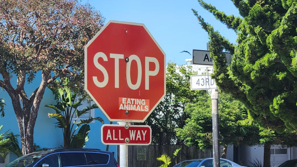
The stop sign with an unexpected message
A sticker placed in just the right spot makes this stop sign look like it’s giving dietary advice instead of traffic instructions.
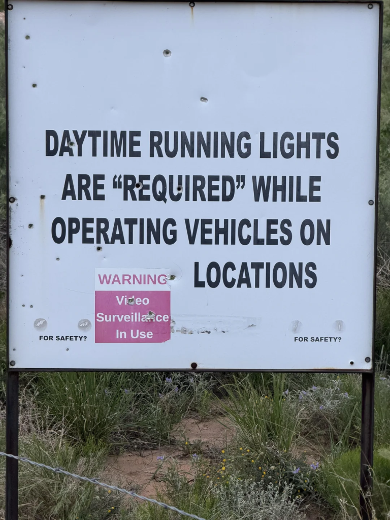
The sign that questions itself
Putting quotation marks around the word “required” makes the instruction sound a lot less convincing than it probably should.
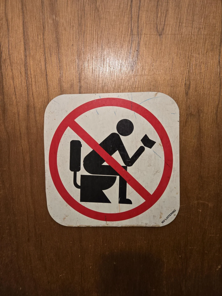
The bathroom sign that sends mixed signals
At first glance, it looks like reading on the toilet is what’s actually forbidden.
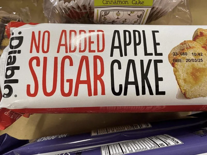
The packaging that needs punctuation
Without better spacing, the label almost sounds like “apple” is the missing ingredient instead of sugar.
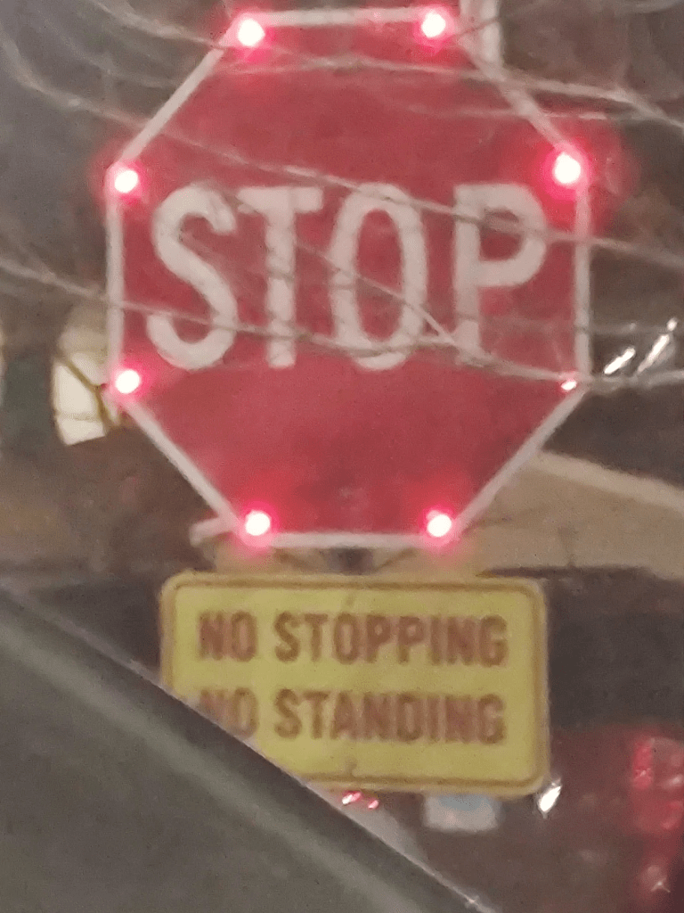
The stop sign that says not to stop
Putting “STOP” directly above a “No Stopping” sign creates an instantly confusing message for drivers.
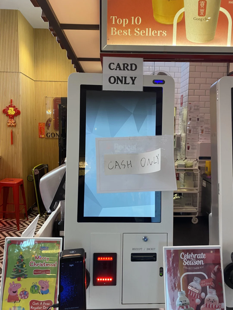
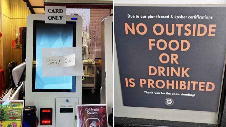
The checkout with an identity crisis
One sign says card only while another taped over the screen says cash only, leaving customers to guess which one is correct.
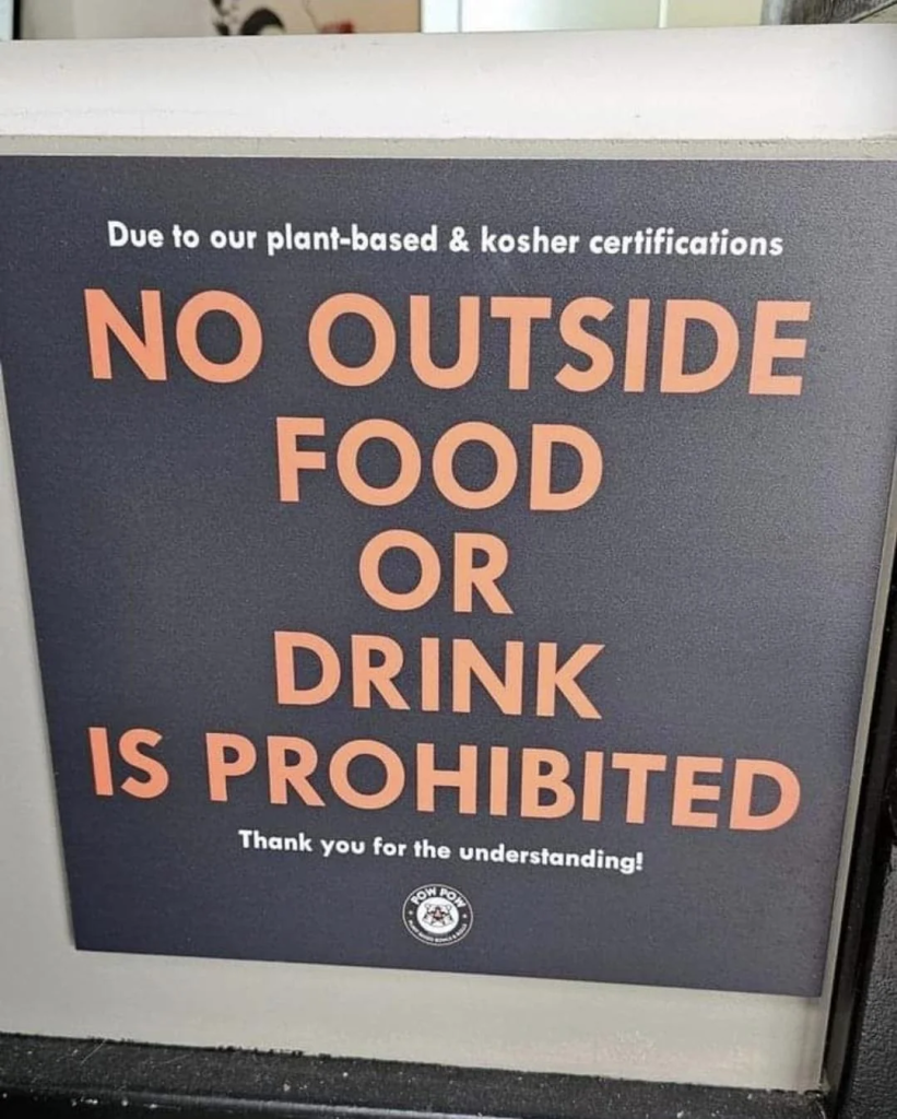
The restaurant rule with awkward wording
The sentence accidentally sounds like food or drink itself is prohibited, not just bringing it in from outside.
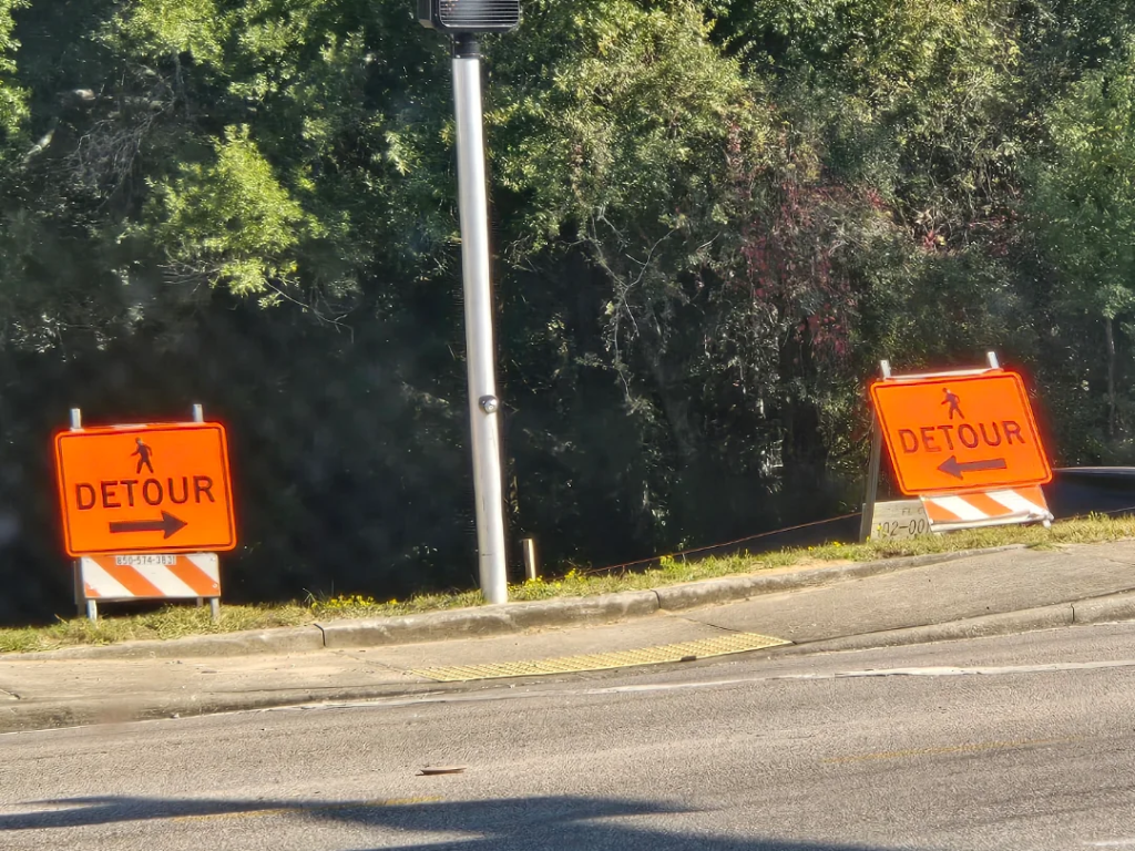
The detour that points both ways
When both detour signs point in opposite directions, choosing a route becomes pure guesswork.

The yearbook ad that’s hard to read
The oversized lettering makes the sentence much harder to understand than it should be.
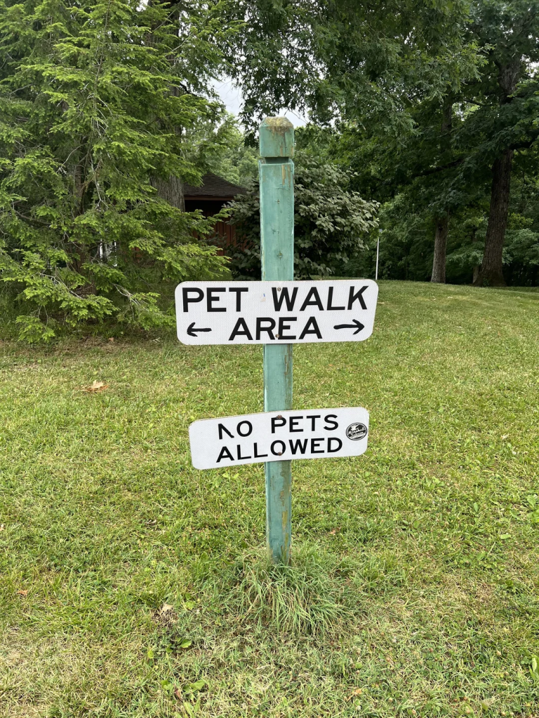
The pet area where pets aren’t allowed
One sign directs visitors to the pet walk area while another immediately says no pets are allowed.
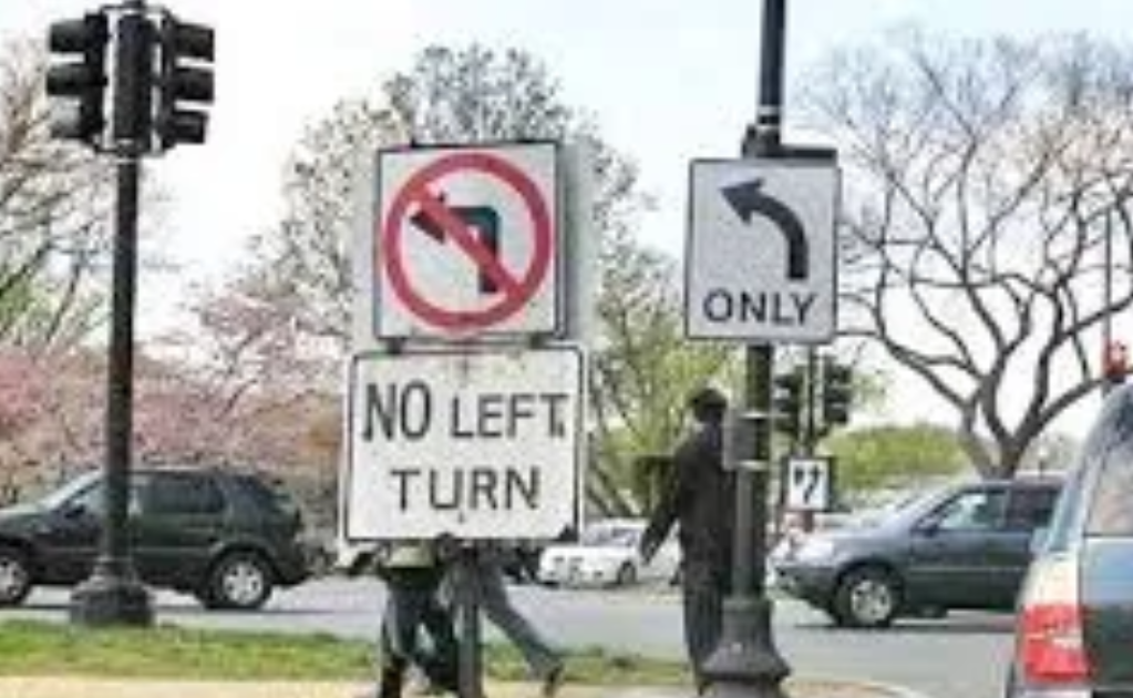
The intersection with conflicting directions
One sign bans left turns while the one beside it appears to allow one.
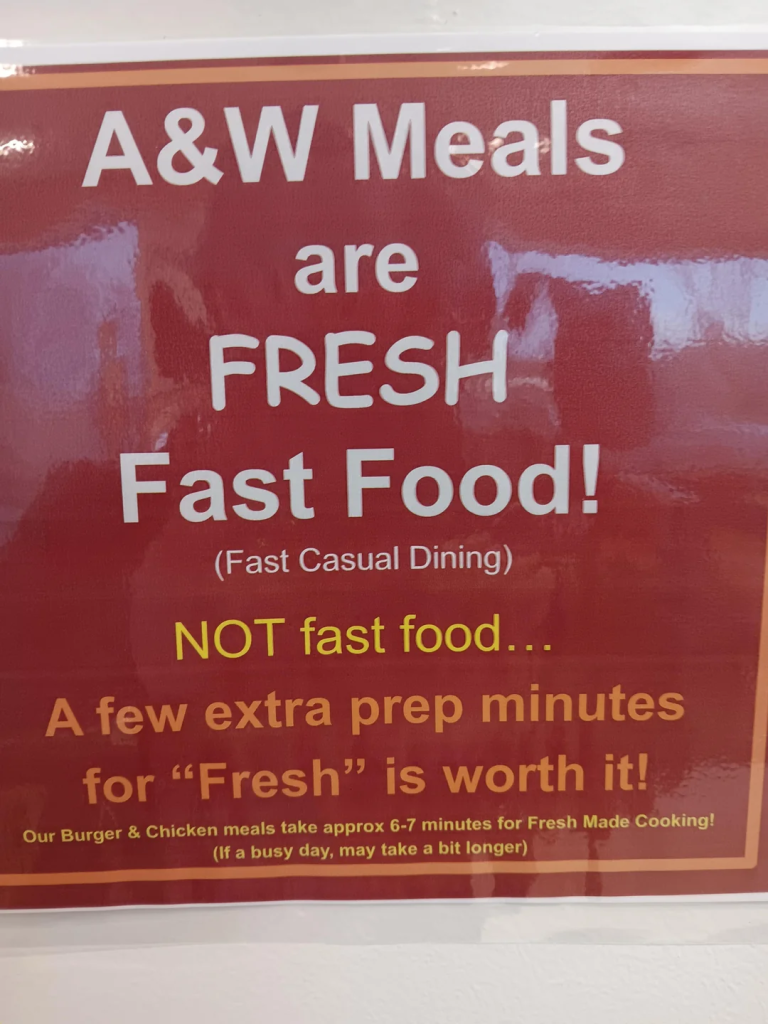
The fast food that isn’t fast food
The restaurant proudly advertises fast food before explaining that it isn’t actually fast.
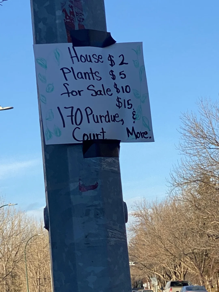
The plant sale with impossible pricing
The way the prices are written makes it look like the house itself costs $2 before the sign finally starts making sense.
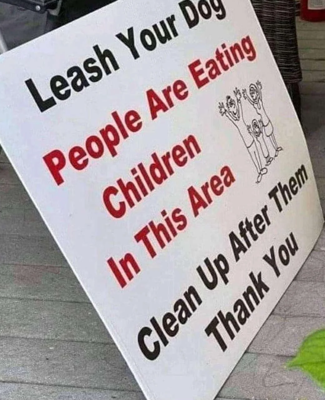
The sign with a very unfortunate sentence
The missing punctuation makes it sound like dogs need to be leashed because people are eating children.
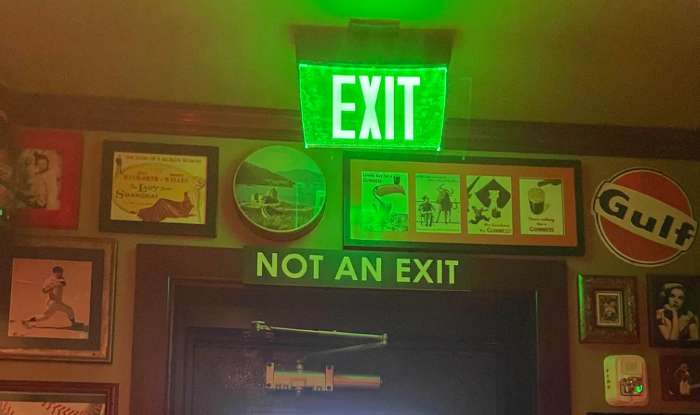
The exit that definitely isn’t an exit
Seeing an illuminated EXIT sign directly above a “NOT AN EXIT” notice is enough to make anyone stop and think twice.